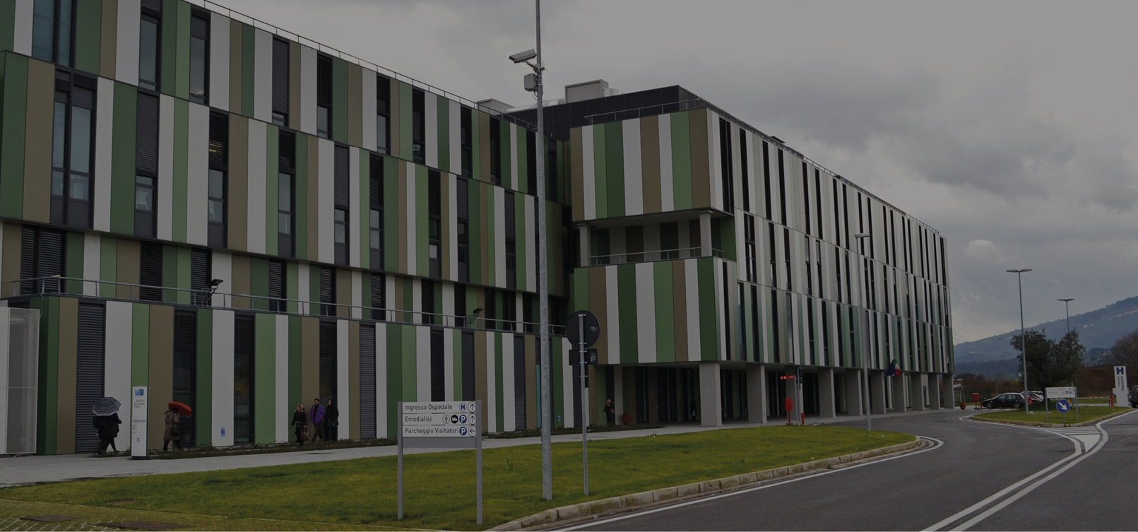
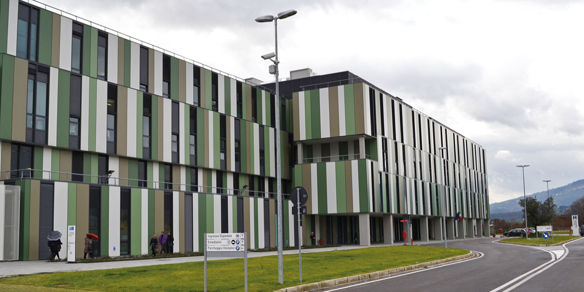
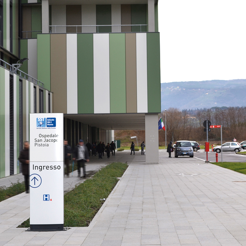
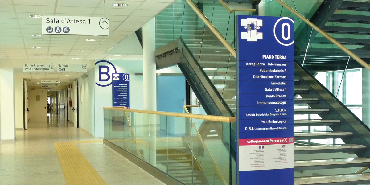
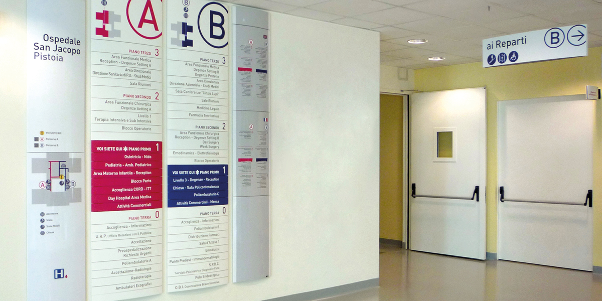
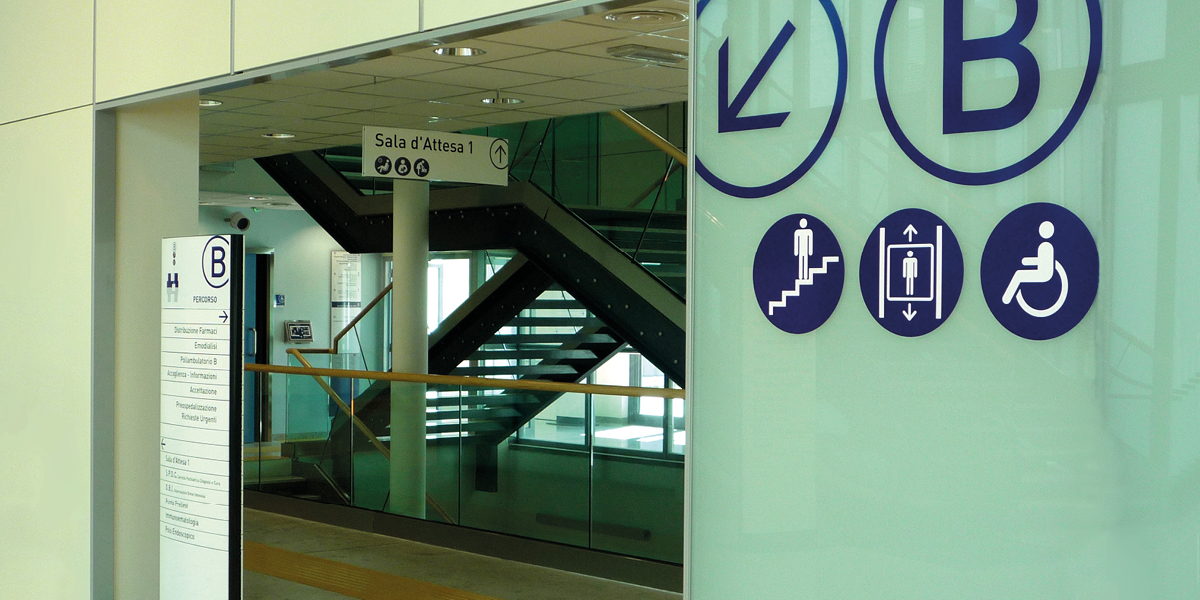
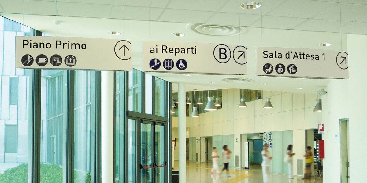
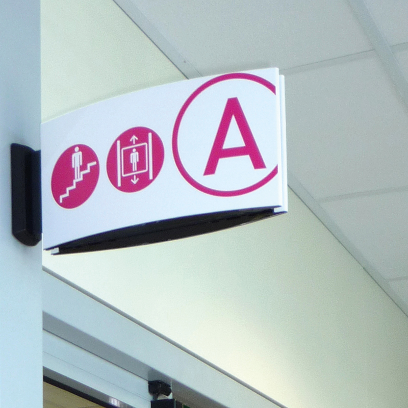
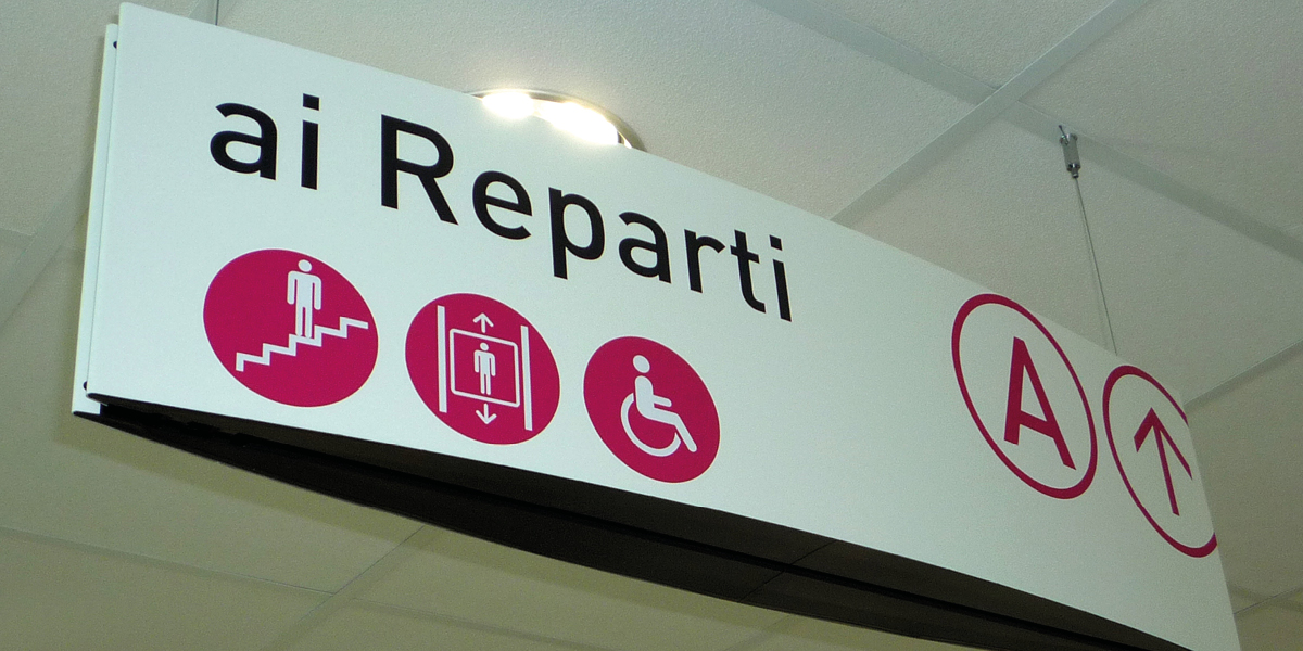
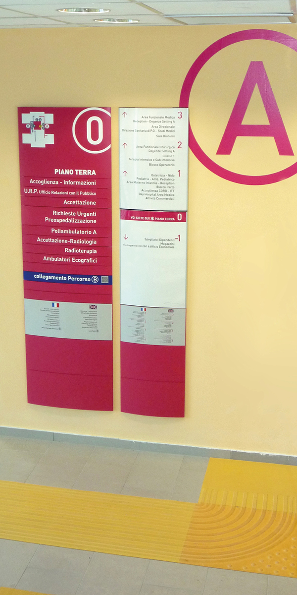
A few simple rules often help achieve the objective. Two examples of projects where color, combined with concise and highly legible lettering, plays a crucial role in orientation inside complex structures such as hospitals.
The Local Health Authority 3 of Pistoia and the Local Health Authority 4 of Prato have respectively chosen IKON Segnali for the new hospitals of San Jacopo and San Stefano.
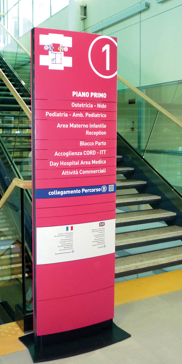
The ‘Wayfinding’ projects are characterized by strong contrasting color elements (blue with magenta red, green with orange) identifying visitor paths, marked by ‘A’ and ‘B’ alphabet letters.
But worth noting is an interesting novelty: the use of QR codes in the main orientation signs, as the signage also aims to communicate and educate citizens. Information regarding the activities and services available at the hospital is stored in the QR code and can be read via a mobile phone or smartphone.


